7 HMI Programming Tips for Beginners

An HMI is where machine logic becomes visible to the people operating it. A clear screen can help someone spot a stopped conveyor, read a temperature, or acknowledge an alarm without hunting through menus. For beginners, hmi programming is not just arranging buttons and colors. It also means presenting useful information consistently and making actions understandable.

The business case is substantial, but good design still takes care. Deloitte and MAPI’s 2024 Smart Manufacturing Survey reported that 86% of surveyed manufacturing executives expected smart manufacturing to drive competitiveness within five years. That figure describes an industry-wide expectation, not a guarantee that every new interface will work well. ISA-101, the International Society of Automation’s HMI design standard series, offers guidance for developing and managing operator interfaces. These sources point to a practical lesson: interface choices belong in the engineering process, not just the final visual polish.

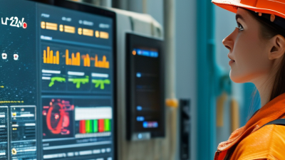
This beginner’s guide introduces seven useful hmi programming tips, from planning screen navigation to choosing readable colors, organizing tags, and testing alarms. Picture an operator wearing gloves, standing several feet from a panel, and needing to identify a fault quickly. Tiny labels may look tidy on a laptop. They can fail in that moment. Even experienced teams sometimes miss such details, so review and testing matter. The aim is not a perfect screen on the first try. It is a dependable interface that makes the next action clear.

7 HMI Programming Tips for Beginners

Understanding HMI Systems and Their Role in Automation

An HMI, or human-machine interface, gives operators a practical view of an automated process. Sensors report conditions such as tank level or conveyor speed, while a controller handles programmed logic. The HMI displays selected values and lets authorized users enter commands. It is not the controller. That distinction matters. If a pump stops, an alarm can show the fault and its time, helping staff investigate instead of guessing.

For beginners, the main design question is what an operator needs to notice or change during a normal shift. A crowded screen can hide a low-pressure warning among decorative graphics. Use clear labels, consistent units, and colors with meaning; a red banner should signal something that needs attention. Keep common controls easy to find, but place consequential actions behind a confirmation step. Small details count.

Test the display against actual operating scenarios, not just a tidy demonstration. Can an operator recognize a stopped motor, understand the alarm, and find the relevant screen without hunting? Check how values behave when communication is lost; stale numbers may look reassuring, which is a quiet design weakness. I would review one screen with a technician before copying its layout elsewhere. Even a sensible design can miss a detail.

Planning Clear Screens Around Operator Tasks

7 HMI Programming Tips for Beginners
Planning Clear Screens Around Operator Tasks

Build each HMI screen around a real operator task, not the equipment list. Ask what the operator must notice, decide, and do during normal running or an upset. Put the key status and next action near each other. A pump screen, for example, might show running state, flow, and the relevant stop control together. Keep it visible. Avoid making operators hunt through nested pages for routine actions.

Use consistent labels, units, colors, and control positions across screens. Reserve strong colors for conditions that need attention; if every value flashes, nothing stands out. The U.S. Bureau of Labor Statistics reported 5,283 fatal work injuries in 2023 in its National Census of Fatal Occupational Injuries. That report is not an HMI study, but it is a reminder that industrial work carries real risks. Clear layouts cannot prevent every incident, yet they can make important information easier to find.

Sketch screens before programming, then test them with someone who performs the task. Give them a practical prompt, such as finding a high-temperature reading and locating the response control. Watch where they pause or misread a label. A first draft may still feel crowded; that is useful feedback, not failure. I would question any layout that only makes sense to its creator. Keep changing it until the task flow feels natural.

Connecting Tags to Controllers and Process Data

Connecting HMI tags to controllers is more than matching names. Each displayed value needs a clear source, data type, engineering unit, and update rate. A temperature tag, for example, should show degrees Celsius—not an unexplained raw integer. The 2024 State of Smart Manufacturing report found that 95% of surveyed manufacturers were using or evaluating smart manufacturing technology. That makes reliable data connections increasingly important, not optional.

Tip: Build a small tag map before programming. Record each controller address, display label, unit, and alarm threshold. Check scaling with a known value, such as a simulated 50°C reading. Set sensible refresh rates; updating every value too quickly can add network traffic without helping an operator. Keep names consistent. It saves time later.

Test more than the normal case. Disconnect the controller and check whether the HMI clearly marks data as stale or unavailable. Try sensor limits, communication delays, and unexpected values. I still find tag tables easy to rush; that is exactly where silent mistakes hide. Review the mapping with someone who understands the process, then compare live readings against a trusted instrument before release.

Building Consistent Navigation, Controls, and Alarms

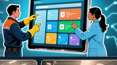
Consistent navigation reduces hesitation when an operator is watching a process, not studying the screen. Keep the main menu in the same place on every page, and group screens by task or equipment area. Use short, familiar labels such as “Overview” or “Pump Status.” Avoid making icons carry meaning alone; pair them with text. Keep it predictable. Show the current location with a clear highlight, and provide a direct route back to the overview. A deep menu may look tidy, but it can slow people down during a busy shift. I still find it easy to add one extra screen too many, so review the path with someone who uses the system.

Controls need consistent size, position, and feedback. Use the same visual treatment for buttons that perform the same action. Make active, unavailable, and selected states visibly different, and don’t rely on color alone. Leave enough spacing for touch input, especially near frequently used controls. Confirm important commands with a clear status change, not just a brief animation. Test in context. A control that works neatly on a desktop may feel cramped on the actual panel.

Alarms should communicate priority, cause, and a useful next step. Sort them by operational importance, following the site’s risk assessment, rather than by arrival time alone. Use plain descriptions, such as “Tank level high,” and show the affected equipment. Acknowledge and clear should mean different things: acknowledgment confirms awareness, not resolution. Avoid flooding the display with repeated messages. Review alarm wording with operators; their first questions often reveal what the screen still fails to explain.

Testing HMI Projects Before Deployment

7 HMI Programming Tips for Beginners
Testing HMI Projects Before Deployment

An HMI can look polished on a laptop and still fail on the plant floor. Test the project at the screen’s actual resolution, with realistic lighting and normal operator gloves. Check every touch target, especially small alarm buttons. A simulator helps, but it cannot reveal every issue with a physical panel.

Tip: Walk through common tasks. Start a normal cycle, acknowledge an alarm, and change a permitted setting. Confirm that labels, units, and status colors remain clear. Then test unusual conditions, such as a disconnected sensor or a value outside its expected range. The display should show a useful message, not a blank field.

Tip: Test permissions and recovery. Sign in with different user roles and verify that restricted controls behave as intended. Interrupt communication during a test, then restore it and check whether displayed values update correctly. Keep a simple record of each result. It is easy to rush this step; I would still spend more time checking how alarms clear after recovery. Recheck those details on the actual hardware before deployment.

7 HMI Programming Tips for Beginners - Testing HMI Projects Before Deployment

Test area What to check How to test Example pass criteria Priority
1. Screen navigation Buttons, menus, back links, and screen transitions lead to the intended pages. Follow each navigation path from the home screen, including alternate routes and return paths. All links open the correct screen; no dead ends or unintended transitions occur. High
2. Tag and data binding Displayed values and controls are linked to the correct controller tags, data types, and units. Use simulated or test values and compare the HMI display with the source values. Values update as expected, use the correct units, and do not show swapped or stale data. High
3. Operator inputs Numeric fields, selectors, and command buttons accept only valid inputs and provide clear feedback. Test normal values, boundary values, out-of-range values, empty entries, and canceled actions. Invalid entries are blocked or clearly flagged; valid entries are handled correctly. High
4. Alarms and acknowledgments Alarm conditions, messages, timestamps, priorities, and acknowledgment behavior are correct. Trigger representative alarm conditions, acknowledge them, and check active and historical views. Each test alarm appears with the expected message and status; acknowledgment does not clear an active cause. High
5. Communication loss and recovery The interface indicates connection loss and recovers safely when communication returns. Disconnect the test connection, observe displayed values and controls, then restore communication. Loss is clearly indicated; stale data is not presented as current; normal updates resume after reconnection. High
6. Permissions and safety prompts Role-based access, confirmation prompts, and protected actions behave as specified. Test each user role and attempt protected actions with and without the required authorization. Unauthorized actions are denied; confirmation prompts identify the action before it is executed. High
7. Layout, readability, and runtime checks Text, colors, units, and touch targets remain usable at the target display size; the project runs without errors. Preview at the intended resolution, review every screen, and run the project for an extended test period. No clipped content or overlapping controls; critical information is readable; no unresolved runtime errors remain. Medium–High
Scroll to Top